Kansas Snapshots by Gloria Freeland - April 8, 2016
Another glass of Marsala, please!
I was recently surprised to learn that New Jersey-based Pantone Inc. has been selecting a "Color of the Year" since
2000. This year’s selection is actually a duet - Rose Quartz and Serenity - also known as pink and blue.
"What's that about?" I wondered.
I am familiar with the company's Pantone Matching System, which is widely used in printing. It allows colors to
be accurately reproduced, regardless of the equipment used. Colors are assigned a number and they are frequently found in
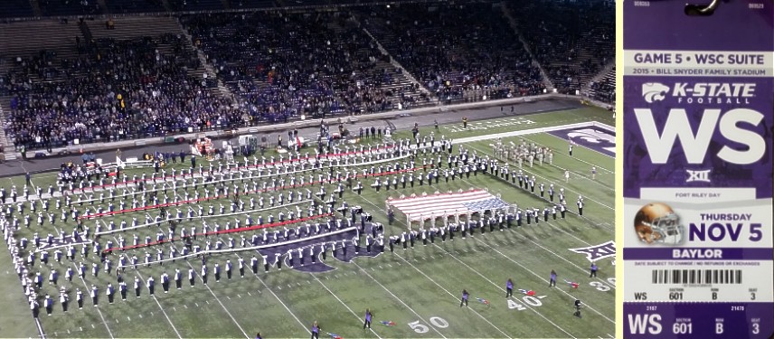
government legislation and military standards for items such as flags and seals or in branded items. Kansas State
University has selected Pantone 268 as the official purple to be used in brochures, fliers, posters, banners and so on.
But I had never heard of the Color of the Year until I encountered it in several publications - Parade magazine,
the Manhattan Mercury's "Spring Home and Garden" section and Antique Week.
According to Wikipedia, Pantone's origin can be traced to M & J Levine Advertising in New York City. In 1956,
founding brothers Mervin and Jesse Levine hired Hofstra University graduate Lawrence Herbert as a part-time employee in
its commercial printing operation. Herbert used his chemistry knowledge to systematize the company's pigments and
production of colored inks. He eventually purchased the company's technological assets and renamed the operation
"Pantone."
But what is the Color of the Year and what is the reasoning behind having one? According to the Pantone website:
As consumers seek mindfulness and well-being as an antidote to modern day stresses, welcoming colors that
psychologically fulfill our yearning for reassurance and security are becoming more prominent. Joined together, Rose
Quartz and Serenity demonstrate an inherent balance between a warmer embracing rose tone and the cooler tranquil blue,
reflecting connection and wellness as well as a soothing sense of order and peace.
The prevalent combination of Rose Quartz and Serenity also challenges traditional perceptions of color association.
In many parts of the world, we are experiencing a gender blur as it relates to fashion, which has in turn impacted
color trends throughout all other areas of design ...
Hmm! It is now spring and I love the rainbow of colors - yellow forsythia, white- and pink-blossomed Bradford pears,
yellow, red and pink tulips, lavender redbuds and purple lilacs and irises. But as much as I like different hues, I can't
say I've ever been particularly good at putting them together into any sort of "theme," whether in my home, wardrobe or
makeup. I decided I had to look further to see if this was something for me or not. So I looked into how Pantone makes a
selection of its Color of the Year. I learned the company hosts a secret meeting of representatives from various nations'
color standards groups. After two days of presentations and discussions, they make a choice.
According to the Pantone people, "color has always been an integral part of how a culture expresses the attitudes and
emotions of the times."
As examples, they cite the colors of the 1960s - Hot Pink, Orange, Grass Green and Bright Violet - as reflecting the
rise of youth culture, counterculture and social revolution.
I do recall how a few of us wore pink, orange, green and violet flared pants, halter tops and hot pants in those days.
According to the company, the recession and growing environmental awareness in the 1970s brought "earthy colors" such
as Harvest Gold, Avocado and Rust.
Remember those Harvest Gold appliances, Avocado shag carpeting and Rust sofas?
The 1980s brought MTV and an economic upturn, which led to vibrant colors, such as Radiant Orchid, Royal Blue and
Ribbon Red, and the 1990s, with the rise of grunge, graffiti and Zen saw Overcast, Lead Gray and Firecracker.
I must have slept through that period as I don't remember them at all.
GMA News Online - originally a Philippine-based broadcasting company - interviewed interior designers and visual
artists to get their opinions on Pantone's decision. Aaron Paglicawan, managing partner of interior design and visual
merchandising firm Detalye Design Group, said he thinks Pantone is making a statement with this year's choices.
We are entering an era similar to the onset of the Industrial Revolution. During the last quarter of 2015, we have
seen a lot of advancement in technology, medical research, economy in general. People are also more conscious now of our
role to take care of the environment. The earth is generally peaceful and people are going back to the old ways of slow,
stress-free living ... With such a chaotic environment we are in, I think Pantone is trying to calm things a bit with
this choice of colors. Rose Quartz and Serenity, for me, depicts humility, peace and equality.
Visual artist Nice Buenaventura thinks the colors are a little too subtle.
I'm not in love with either. They're a bit too muted for my liking. But I love the idea that Pantone decided to pick
two colors of the year at once. ... I think the decision is a well-justified departure, and it's evidence that the art
and design world is responsive to global issues and societal trends - most notably the great gender blur.
So what do I think of all this? Well, the color for 2000 was Cerulean - the shade of a dark blue sky - and last year it
was Marsala - the hue of a brown-red wine made in Sicily. I think right now I could use a glass of Marsala as I gaze into
the cerulean sky from our deck ... and forget the Color of the Year!